27I want to make it look my way
40 themes, dark mode, home layouts, and icon packs
- Everything here is Settings → Appearance. Nothing needs switching on first.
- The Beta Features section is hidden in Basic mode - switch to Advanced mode to see it.
- Your choices follow your account, so the app looks the same on every device you sign in on.
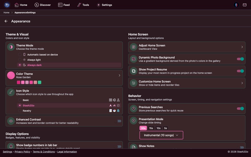
Go to Settings → Appearance to access all visual customization options. From here you can change your color theme, toggle dark mode, pick a home screen layout, switch icon packs, enable accessibility features, and configure display preferences. This is where you make Stash2Go look and feel exactly how you want it.
A walkthrough of every section of Appearance - the theme and how solid it looks, dark mode, icon packs, the home screen, the forum, the betas, and what the presentation settings do.
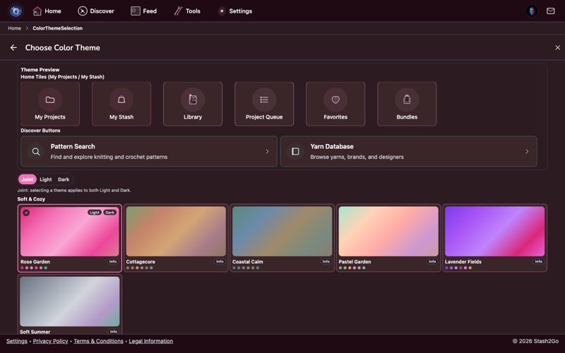
Pick from 40 handcrafted themes, grouped into families - Minimal & Line, Vibrant & Rainbow, Soft & Cozy and more -: Aurora, Coastal Calm, Cottagecore, Dark Academia, Neon Dreams, Vintage Sepia, Deep Space, Sumi & Linen, Chart Paper and many more. Each theme includes coordinated light and dark mode variants with matching accent colors, card borders, and background tones. Some themes use subtle shadows for a clean look, while others use thin colored borders for definition.
Themes affect the entire app - navigation bars, cards, buttons, and highlights all adapt. Your chosen theme is synced across all paired devices.

On the same screen, Surface decides how much the app fills in behind things - the tiles, cards and buttons - independently of which colours you picked. There are six: Default, Minimal, Pure, Light, Regular and Bold. Minimal and Pure are the quiet ones (Minimal even puts the icons away); Regular and Bold paint the accent colour in properly.
A new install starts on Citrus Burst with Light surfaces, both marked Recommended. That is only a starting point. Change either one and the app remembers.


Not sure where to start? The colour theme screen offers Choose your look, a four-question walkthrough - light or dark, the mood you want, how much contrast you need, and finally the theme itself. It ends on four presets: Minimal & Quiet, Cozy & Crafty (the recommended one), Clear & Readable, and Bold & Playful. Apply Style sets theme, surface and contrast together.
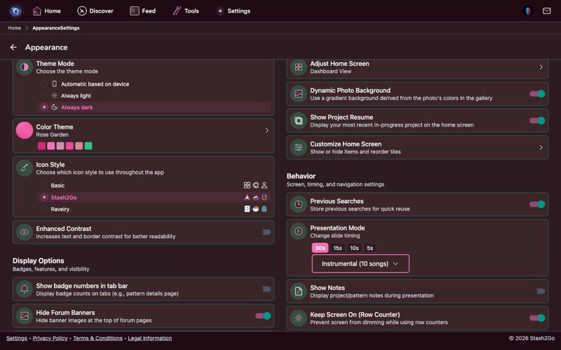
Three options: Light for bright backgrounds, Dark for reduced glare and battery savings on OLED screens, or Auto which follows your device's system setting (switches automatically at sunset if your device is configured that way). Every theme is designed to look great in both modes.
Beside it sits Applies to, which decides which mode the theme you pick is saved for: Both, or only Light, or only Dark. That is how you run one theme by day and a different one at night - pick Light, choose your daytime theme, then pick Dark and choose the other.
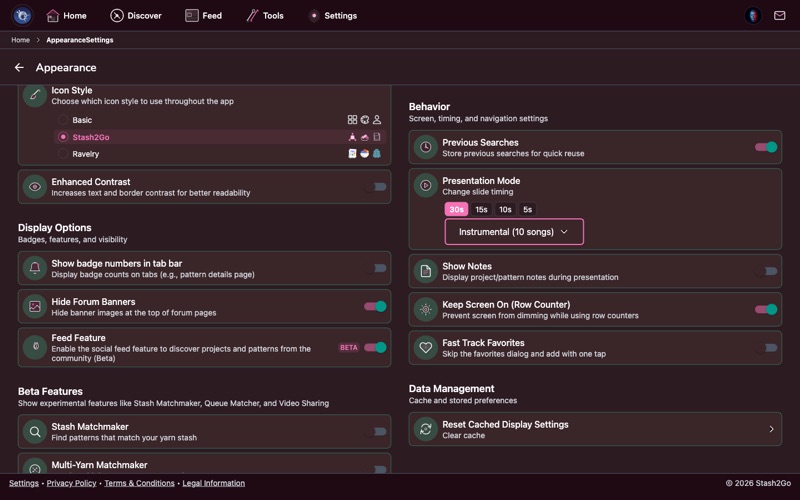
Change the look of your navigation icons:
Basic - Standard system icons for a clean, familiar look.
Stash2Go - Custom craft-themed icons with yarn balls, knitting needles, and crochet hooks.
Ravelry - Ravelry's official icon set for a consistent look if you're used to the Ravelry website.
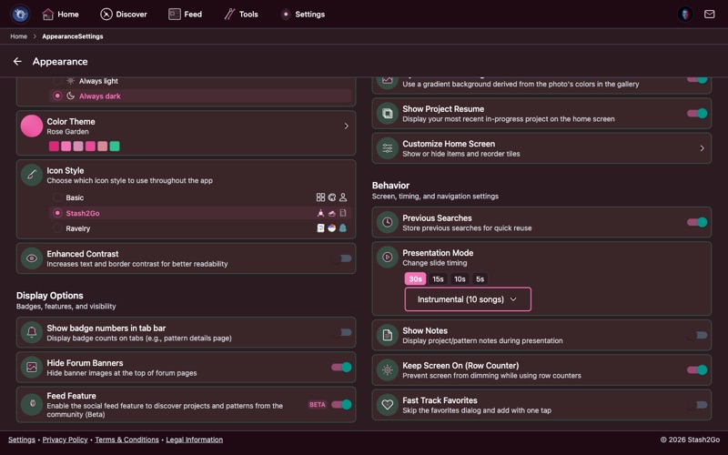
Enhanced Contrast - Swaps the text and delimiter colours for a stronger hand-authored set and gives every card a visible edge, in every theme and every surface style. Great for bright outdoor lighting or low-vision needs. It does not change your accent colours or wash the background out.


Two panels open from the appearance screen itself. Text-to-Speech picks the voice that reads a pattern out to you while your hands are busy, and Voice Commands lets you count rows and turn pages by speaking – see Voice Commands for what it can be told to do.
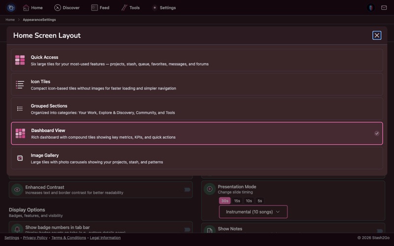
Choose how your home screen is organized:
Image Gallery - Large tiles with photo carousels showing your projects, stash, and patterns.
Icon Tiles - Compact icon-based tiles without images, for faster loading and simpler navigation.
Grouped Sections - Organized into categories: Your Work, Explore & Discovery, Community, and Tools.
Quick Access - Six large tiles for your most-used features.
Dashboard View - A rich dashboard with compound tiles showing key metrics and quick actions.
You can also customize which tiles appear on the home screen and reorder them to match your workflow. Hide features you don't use and keep your most-used shortcuts front and center.

Show badge numbers in tab bar puts counts on the tabs – unread messages, say – or takes them away if you would rather not be nudged.

The forum has a set of its own: Hide Forum Banners for a quieter page, Forum Live Updates for a badge when new posts arrive, Rich Forum Embeds to show linked patterns and projects as cards rather than bare links, Show trending forums on Discover, and Quote & Reply. Underneath, you choose which reactions you want to be able to give: Educational, Interesting, Funny, Agree, Disagree and Love.

Unit Preferences is metric or imperial, once, everywhere – metres or yards, grams or ounces. Previous Searches decides whether recent pattern, yarn and shop searches are remembered. Feed Feature turns the social feed on or off entirely.

Beta features - This section holds four, all off until you switch them on: Top Patterns by Craft Value, Weaving tools, Multi-Yarn Matchmaker, and PDF Tools (Chart Detector and Glossary Overlay – see Let the app find the charts).
The betas that depend on assisted features live in Settings → Assisted Features instead: Studio, Colour Swatcher, the Magazine, and Video Sharing. Forum Live Updates is no longer a beta at all - it sits in Display Options → Forum. (Stash Matchmaker and Queue Matcher have graduated too - they are standard features now.)
Dynamic Photo Background - Uses blurred photos from your projects as your home screen background, creating a personalized look that changes with your latest work.
Keep Screen On (Row Counter) - Keeps the display awake while a row counter is on screen, so you are not waking the phone mid-row. It is on by default, and scoped to the counter rather than the whole app.


Behavior holds the presentation settings: how long each item and each photo is held on screen, which music plays, and whether notes are shown – see Show your craft on a screen. Screen & Device keeps the screen awake while you are counting rows, and offers Fast Track Favorites to skip the favourites dialog. At the bottom, Data Management resets cached display settings and clears the cache.
Available on iPhone, iPad, Android, and web at app.stash2go.com