58I want the app to look the way I like
40 themes, six surface styles, light and dark, atmosphere – a gallery of themes other makers dyed, and a bench to dye your own
Knitting is colour work as much as anything else. You choose a yarn for its shade before you know what it will become. You hold two skeins against each other in the shop light. Then you live with the result on your shoulders for years. A theme is the same decision, made for the app you keep the knitting in: which colours you want to look at, how much texture the surfaces have, and what sits behind the page while you count rows. Ours are a starting point. From version 1.33 you can also use a theme another maker dyed, or dye one yourself.
- Everything here is in one place: Settings → Appearance → Color Theme.
- Nothing to switch on. All of this is there from the start.
- Your choice follows your account. The app looks the same on your phone, your tablet, the web, and your Apple TV.
- Choosing is easier on a big screen. Forty themes side by side, and mixing your own colours, is comfortable work at app.stash2go.com and fiddly on a phone. Pick there, and it is on your phone by the time you sit down with the knitting. You never set it up twice.


Would rather not scroll through 40 themes? The colour theme screen offers Choose your look. It asks three questions: the appearance mode, the mood you want, and how much contrast you need. Then it offers four ready-made answers: Minimal & Quiet, Cozy & Crafty (the recommended one), Clear & Readable and Bold & Playful. Apply Style sets the theme, the surface style and the contrast in one go.
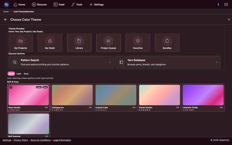
There are 40 themes, grouped into families: Minimal & Line, Vibrant & Rainbow, Soft & Cozy and more. Find the kind of thing you like first, then compare the ones inside it. Each swatch shows its accent colours, and whether it uses a border or a soft glow. The first time you open the app you are on Citrus Burst, marked Recommended.
Forty themes is a lot to scroll past every time. Tap a family heading and it folds away, and it is still folded when you come back. The headings are Minimal & Line, Vibrant & Rainbow, Soft & Cozy, Nature & Earth, Classic & Vintage and Bold & Futuristic. Fold the ones you know are not for you, and the screen becomes a short list of the colours you would really consider. The appearance options at the top fold with the same tap.
Appearance decides which mode you are in right now: Auto (follow the device), Light or Dark.
Beside it, Applies to decides which mode the theme you pick is saved for: Both, only Light, or only Dark. That is how you run one theme by day and another at night. Set Applies to Light and choose your daytime theme. Then set it to Dark and choose the other one. With Appearance on Auto, the app changes over with your device.
Surface is a separate thing from colour. It decides how much the app fills in behind tiles, cards and buttons. There are six: Default, Minimal, Pure, Light, Regular and Bold. Minimal and Pure are the quiet ones, and Minimal puts the icons away as well. Regular and Bold paint the accent colour in properly. You start on Light until you change it.
- Theme vs surface
- The theme is which colours. The surface is how much of them you see. A theme that felt too loud is often the right theme at a quieter surface.
- Enhanced Contrast
- Under Appearance. Swaps the text and border colours for stronger ones and gives every card a visible edge, in every theme and surface style. For bright sunlight, or low vision.
- Icon Style
- Basic (system icons), Stash2Go (hand-drawn craft icons) or Ravelry. Changes the home tiles and the navigation bar.
An atmosphere is a scene drawn very quietly behind the pages: snow falling, leaves turning, yarn balls, stitches, a far-off line of mountains. It sits under everything you read, in the theme’s own colours. It is meant to be noticed the way weather outside a window is noticed: not looked at, but there.
Every theme comes with one, chosen to suit its colours. You decide whether it plays. The control is on the colour theme screen, under Appearance options, beside Appearance, Applies to and Surface. It is not on the Appearance settings screen. Off leaves a plain background. Still draws the scene and lets it be. Drift lets it move, very slowly: snow settling rather than snow falling. If a backdrop pulls at you while you count rows, leave it Off. The theme’s colours are the same either way.


Themes are not only ours. Tools → Theme gallery shows every theme in Stash2Go, beside the ones other makers have dyed and shared. Sort by Most liked, Most used or Newest, or search by name, description or maker. Each card shows the palette as a swatch, what the maker says it came from, and how many people liked it. Like the ones you enjoy. Add the ones you want to use, and they join your own themes. You have to be signed in, because a like and an addition both belong to somebody.


Under the colour theme, Dye your own opens a bench where you mix the colours yourself. Start from the theme you are on, from a photograph, or from nothing at all. The top of the screen is a live preview: your real tiles, in your colours, in the mode you are working in. Give it a name and a description, saying what it came from: a photo, a yarn, a place. Generate colours from description reads that sentence and mixes a palette from it. Or start from a style: Vivid, Jewel, Impressionist, Fauvist, Bauhaus, Nordic, Art nouveau, Undyed wool, Monochrome, Ocean, Forest, Sunset, Autumn, Pastel, Neon, Alpine, Terracotta, Botanical. Tap one for a palette in that spirit, and tap it again for another take on it. Use colours from picture pulls the colours straight out of a photograph: a skein you photographed, a hedgerow, a tiled floor. This is the part worth doing at a keyboard. Everything is bigger, and the theme you make is waiting on your phone afterwards.


A theme is ten colours, one for each part of the app: projects, stash, library, queue, favourites, bundles, friends, messages, forum, and the tools and settings. Set each one by hand, or keep what a style mixed for you. Underneath are the backgrounds for the page, the sections and the cards. Then come the same surface style and card edge the built-in themes use, so what you dye behaves like the rest of them. Theme Mode, Contrast and Vision sit at the top. Vision shows your palette as someone with a colour vision deficiency would see it, which is worth a look before you share. Last comes the atmosphere, the scene that belongs to the theme you are dyeing. There are nineteen of them, plus None. Knitterly ones: Yarn balls, Stitches, Columns. Weather: Snow, Rain, Fog, Clouds, Aurora, Stars. Landscape: Mountains, Icebergs, Waves, Trees, Leaves, Flowers. And a few for brighter palettes: Bokeh, Confetti, Gems, Rainbow. You are choosing what goes with your colours. Whoever uses the theme still decides whether to show it at all.


Save this theme keeps it in My themes, at the top of the colour theme screen. From there it is yours to use like any other. If you want other people to have it, Show in the theme gallery publishes it, and other makers can find it, like it and add it. Your Ravelry name is shown as the maker, so you have to be signed in with Ravelry to publish. You can also Export a theme to a file and Import one back. That is how you move a theme between accounts, or keep a copy of your own.

Everything you dye, and everything you added from the gallery, collects under My themes at the top of the colour theme screen. It sits above the families, because these are the ones you chose. Each of your own carries Edit, which takes it back to the bench, and Delete, which removes it. A published one also says In the gallery, so you can see at a glance which of your themes other people can find.
Available on iPhone, iPad, Android, and web at app.stash2go.com